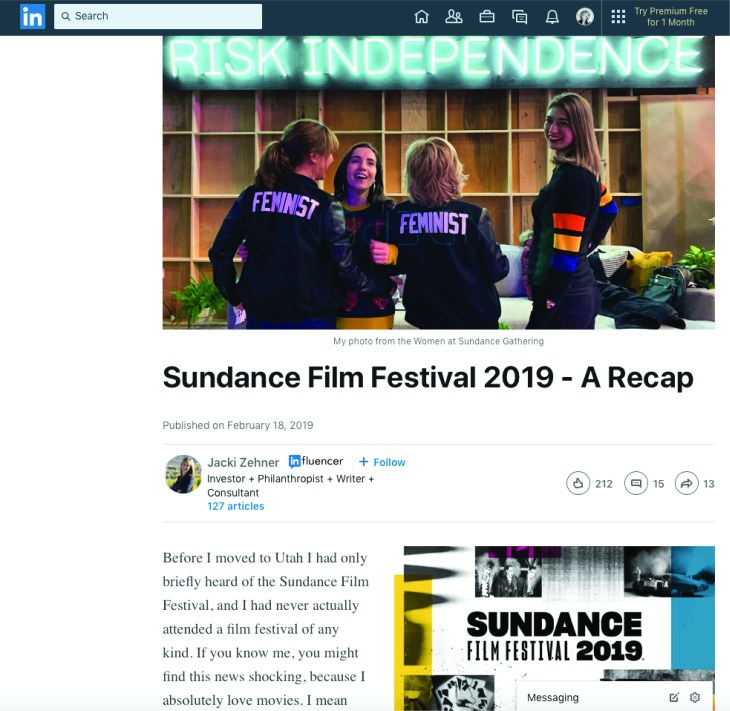
This week, as I was scrolling through LinkedIn I clicked on a link to a news story about the Sundance Film Festival. I live in Utah, but have never been to the festival, so this seemed like an interesting article to read. I loved reading about the movies that the reviewer wrote about. There is so much creativity in these films! The post, itself, was well written, but wasn’t really super interesting to look at. Still, I was able to find that they did follow some design principles in the structure.
First, alignment.
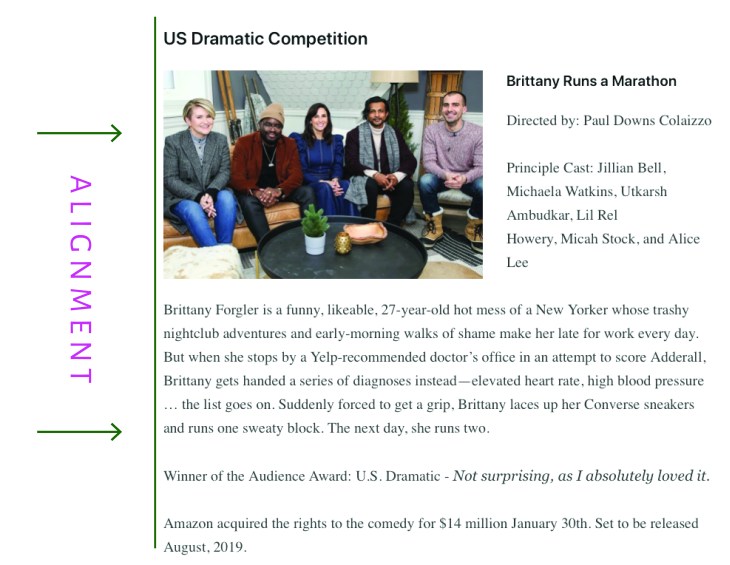
The alignment in this news feed is good because it is predictable and easy to read. The content is always aligned on the left with a rag on the right- which is how we are used to reading in the English language. Nothing super exciting, but consistent, and easy to read.
Second, typography.
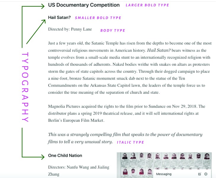
The typography on this news feed design is pretty subtle, but it works. The titles to the film category are the largest and boldest, the names of the films are bold, but not as large as the category, the body type is regular, and the author’s thoughts on the film are always italicized. This makes it easy to pick out the information you would like to read without having to read the entire article.
Third, repetition.
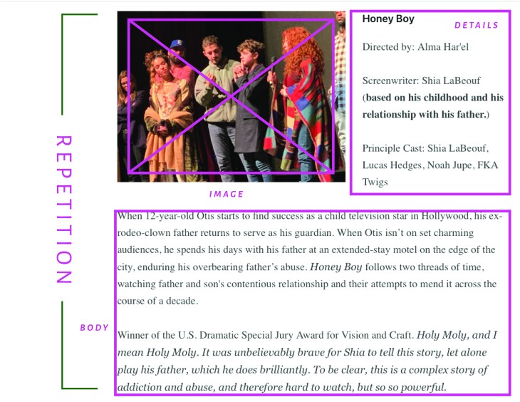
This news feed is consistent in its styling. The setup is always the same with an image sharing rows with the film’s title and actor details, followed by a chunk of body text. There is some variation between the image being on the left and then sometimes on the right, but the overall design is just repeated for each film mentioned.
An easy change.
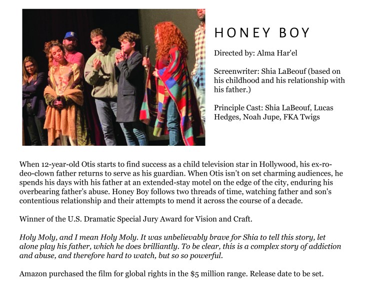
In my opinion, this news feed design could have been improved by simply giving more hierarchy to some of the typographical elements. On this mockup I have kept the same basic structure, but have given the film title more emphasis with the use of a contrasting font- highlighted with wide letter tracking and all caps. I think this super simple change helps the design a lot, because it makes the information more readable.

