REP Sponsered Promotion Post

REPAsset 7.jpg

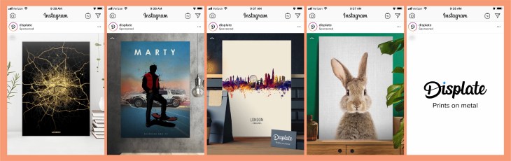
This sponsored post from Displate popped up on my Instagram today. The content scrolled fairly quickly through some samples of their work. By using this format, it caught my eye because it was moving, and made me want to watch since the images were kind of interesting. On the last page, the company’s name and “prints on metal” showed up. This was a great tactic since now I knew kind of what I was looking at. Here are some more details that helped this sponsored post catch my eye…

REPAsset 10.jpg


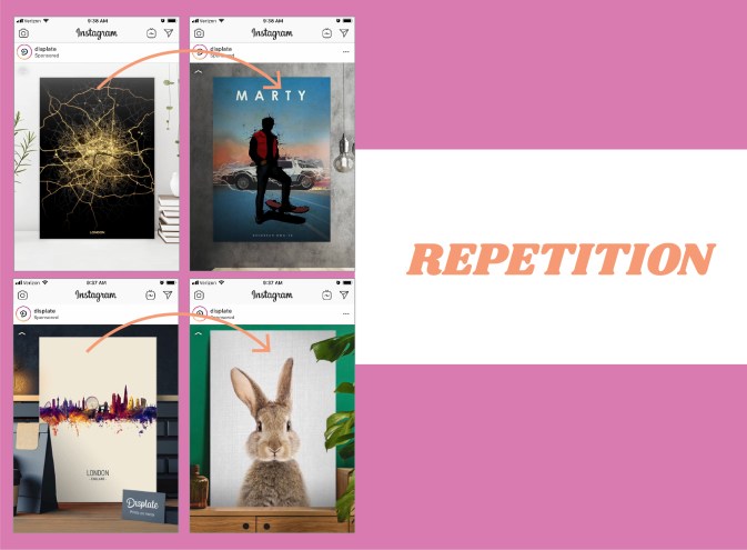
By using the same kind of spacing and alignment on each image being showcased, the scrolling ad took the guesswork out of where I should be looking. Each image popped up in the same spot so that the quick scroll wasn’t too jarring since my eyes could stay focused on the same part of the screen. The repetition of the design was vital to this ad and its quick scrolling images.

REPAsset 5

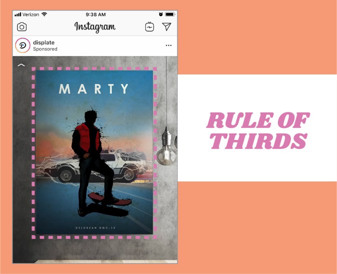
In this example, you can clearly see that the poster image is taking up the majority of the space. The rule of thirds is being applied here since 2/3 of the design is the main image. This makes the image the prominent item in the design, and therefore what your eye really focuses on. This is a good tactic for a company that is selling the item pictured.

REPAsset 6

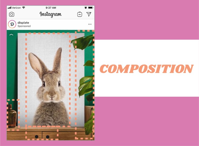
This image is my favorite from the series. The entire composition of the image is really great. The bunny image is directly centered, but the piece doesn’t feel static, because the dresser that it is sitting on is not centered. The leaves on the right and the bottle on the left help the image feel balanced. Another great aspect of this image is the use of color. The green wall contrasts fantastically with the white of the bunny print and the warm wood tones of the dresser.


REP- Native Video

REP1Asset 1@4x-100.jpg

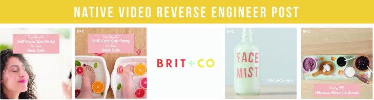
This native video caught my eye due to the beautiful colors, and clean design. I am a sucker for a great color scheme and pulled shots from this native video to create some new color palettes. I love how this video is edited. There are fun animations, a catchy tune, and clean designs and typography. I believe the audience for Brit & Co is women, so they are definitely speaking to their audience with a feminine color scheme and a video about a spa day. Here are some breakdowns of why this video works-

REP2Asset 2@4x-100.jpg

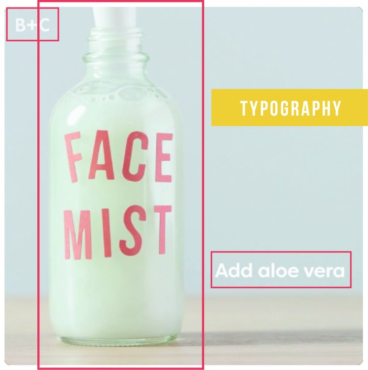
The typography in this video is very subtle and understated. The typefaces are san-serif and give the video a modern, clean feel. By using this typeface throughout the video the design feels seamless. The text is also very easy to read, which is good when someone is watching to see how to do something. I think the subtle branding in the top left corner is awesome. You don’t notice it so much when you are watching the video, so it is not distracting, but the company’s brand is visible on each frame.

REP3Asset 3@4x-100.jpg

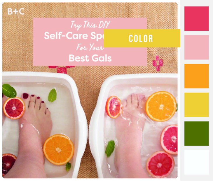
The colors in this video really work. They are bright and springy- which was really appealing to me on this dreary day in March. The colors also feel young and vibrant, which definitely resonates with Brit & Co’s user base. The use of white in the frames help the colors pop. The organicness of the sliced fruit and its beautiful color really tie into what the video is about. The use of color throughout this video is probably one of it’s strongest elements.

REP4Asset 4@4x-100.jpg

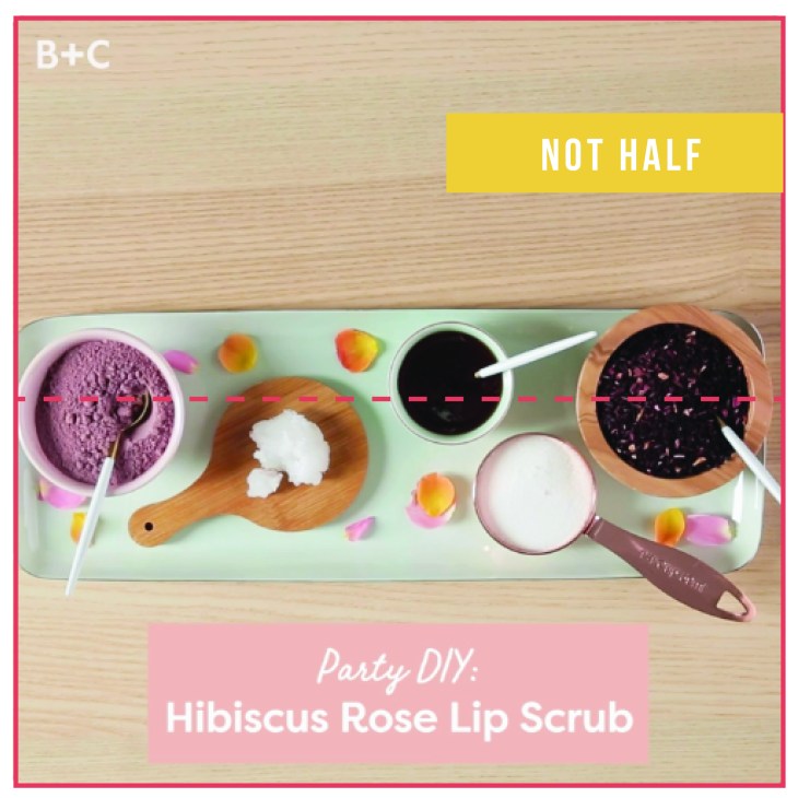
Another principle the artists implemented into this video is the principle of not half or asymmetry. There are a lot of shots in that fit that description. Everything is kind of just slightly off-center. I think by using this principle, the overall feeling is more artistic and also has a feeling of movement- even if the background is still.

I loved dissecting this awesome native video from Brit & Co. Their clever use of color, asymmetry, and typography make this video an inspiration piece for future work.


Reverse Engineer Post- News Feed

BlogPostPicAsset 1@4x-100.jpg

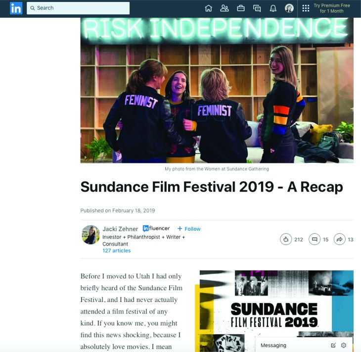
This week, as I was scrolling through LinkedIn I clicked on a link to a news story about the Sundance Film Festival. I live in Utah, but have never been to the festival, so this seemed like an interesting article to read. I loved reading about the movies that the reviewer wrote about. There is so much creativity in these films! The post, itself, was well written, but wasn’t really super interesting to look at. Still, I was able to find that they did follow some design principles in the structure.

First, alignment.

BlogPostPicAsset 2@4x-100.jpg

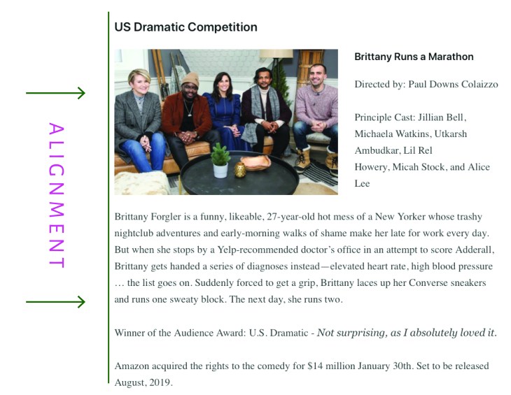
The alignment in this news feed is good because it is predictable and easy to read. The content is always aligned on the left with a rag on the right- which is how we are used to reading in the English language. Nothing super exciting, but consistent, and easy to read.


Second, typography.

BlogPostPicAsset 3@4x-100.jpg

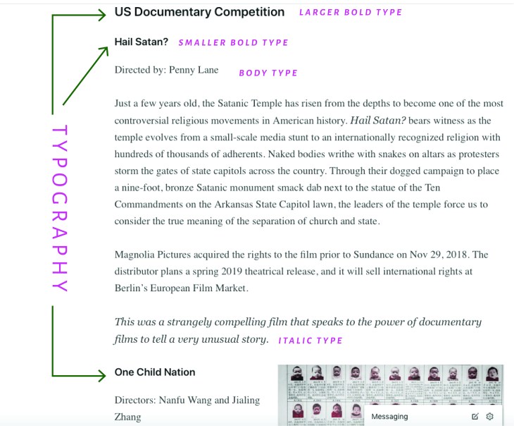
The typography on this news feed design is pretty subtle, but it works. The titles to the film category are the largest and boldest, the names of the films are bold, but not as large as the category, the body type is regular, and the author’s thoughts on the film are always italicized. This makes it easy to pick out the information you would like to read without having to read the entire article.


Third, repetition.

BlogPostPicAsset 4@4x-100.jpg

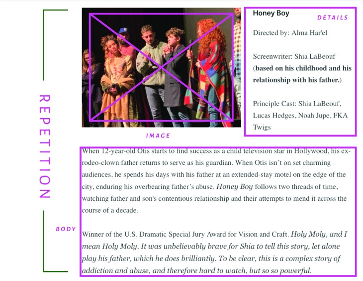
This news feed is consistent in its styling. The setup is always the same with an image sharing rows with the film’s title and actor details, followed by a chunk of body text. There is some variation between the image being on the left and then sometimes on the right, but the overall design is just repeated for each film mentioned.


An easy change.

BlogPostPicAsset 5@4x-100.jpg

In my opinion, this news feed design could have been improved by simply giving more hierarchy to some of the typographical elements. On this mockup I have kept the same basic structure, but have given the film title more emphasis with the use of a contrasting font- highlighted with wide letter tracking and all caps.  I think this super simple change helps the design a lot, because it makes the information more readable.

Brand Identity

IPPIE PLAN

OBJECTIVES:

The message of this brand is happiness conveyed through bubble gum. The feelings of youth and pluck will be conveyed through bright colors and fun images. The target audience is mainly women between the ages of 18 and 50.  After viewing the messages of this brand the viewer should be lighter and happier than they were before. The goal is that they put a smile on their face and confront their day with hope and optimism. A secondary goal is that they look for the fun in everyday experiences, and learn not to take themselves too seriously.  I hope that by viewing the vibrant images on these channels the user will be able to instantly smile, and then recollect the colors, feelings, and messages throughout their days and weeks.

SEASCAPE PRINCPLES:

The “value principle” will come into play in these social media channels. The hope is that the user will gain joy from simply viewing the content. They don’t need to buy anything, although it may make them crave gum, they simply get to look at the post and feel something. The return on the viewing investment time will be more than worth it if these channels can deliver great content that is beautiful to look at.  The “Zeitgeist principle” will also come into play on these channels. There is so much negativity and heaviness in what we consume online and in our lives, that people are looking for an escape. This brand hopes to be that escape for people. “Taking action” for this social media brand will be viewing the content and coming back again to view more posts. When branding this channel we will strive to avoid these taboos- posting mediocre photos, going too “off brand”, not responding to comments,  omitting captions, and being inconsistent.  The messages presented will also always try to convey fun and happiness, no other political or personal agenda.

STRATEGY

To connect with our audience this brand will consistently post content, make sure the content is relative to the brand and reply to comments.

The channels I have chosen to use for this branding project are Instagram and Pinterest. Both platforms get results from good images, so the images created for this brand have to be cohesive with the brand objective and be eye-catching. They have similar taboos in that you shouldn’t follow or repin content that is not cohesive with your brand. They also require consistent engagement and comment interaction where appropriate. For both platforms the most important piece of content is the image. If the image falls flat, nobody is going to engage with your brand- the images are king on these platforms. Also important are hashtags, and captions. The captions and descriptions for the images must be relevant and reflect the goal of happiness within the brand.

CONTENT NEEDED

Image: In both PInterest and Instagram, the images are the key. The feeds are visually oriented, so the image has got to be eye-catching.  In Pinterest the recommended size for pins that generate interaction  is 735 px x 1102 px. The long images command more viewing real estate and are a great way to get your image seen. On Instagram the design should be done in 1080 px by 1080 px. (But upload the image at 2048 by 2048)

Caption/Description

In Pinterest, write descriptions that are thoughtful and that your user can understand. Use keywords, but don’t stuff them in if they don’t add value to your description. Also, the use of “salesy” text is discouraged.  The content for Instagram is similar.

Keywords/Hashtags

In Pinterest, you can optimize your pins for searchability by adding keywords. Relevant hashtags can also help your content be found by Pinterest users. Like Pinterest, Instagram allows you to implement hashtags that can be used to help viewers find your content. Care must be taken in choosing these hashtags, and be sure to make sure not to use any banned hashtags.


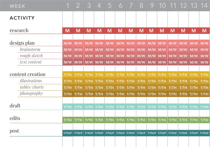
SCHEDULE
GanntChartWK5Asset 2@4x-100


DEFINE SUCCESS

The metrics that will best help me determine the success of my social media sites will be the number of visitors to my channels, and the number of repeat visitors and or followers.


VOICE STATEMENT

The “I Heart Gum” brand should feel fun. It should convey feelings of nostalgia and childhood. Although the subject matter could be considered juvenile, the design will be sophisticated with pluck! The feed will be full of fun colors and playful designs that should evoke a smile or a feeling of inspiration. The messages are always light and playful, never divisive or confrontational.

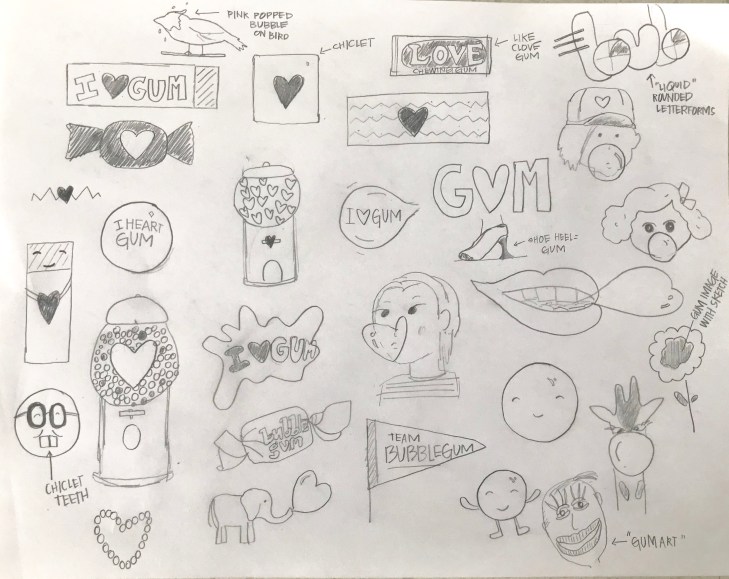
LOGO SKETCHES
Comm315BrandLogoSketchesWK5.jpg

Lolli and Pops- Reverse Engineer Post


315Wk5Asset 4@4x-100

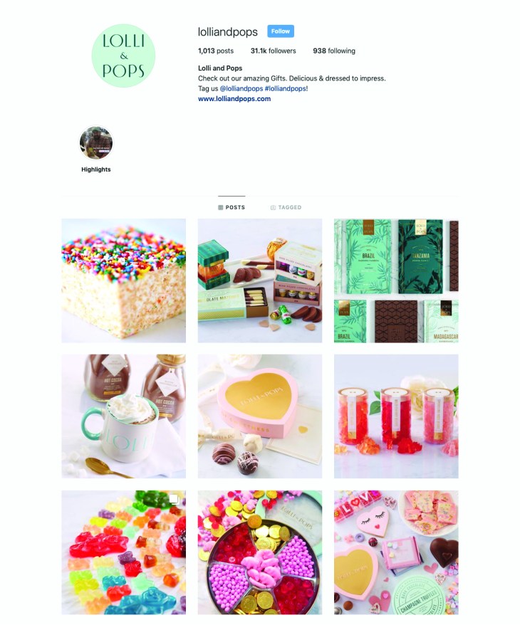
You guys! Don’t you just love the look and feel of this social media campaign!? Lolli and Pops is a candy company that promotes smiles and sweets. They use beautiful colors and packaging to sell their yummy confections. The audience for Lolli and Pops social media channels are adults that love sweets. I would imagine the purveyors of their sites love good design and are willing to pay for beautiful packaging. Lolli and Pop is embracing the “seascape” in a lot of ways. One thing that stands out to me is their focus on color and lightness- this conveys happiness. Zeitgeist is the principle that best fits this. At this time in history, with so much negativity, I think a lot of people crave something that is just fun and simple. Lolli and Pops promotes this principle through sugar and great design! Another principle they are applying is perception. This company is known for its beautiful packaging and yummy sweets. They keep that consistent in their social media images. They also know that the people that are viewing their content are concerned by how they are presented as well. When you buy someone a beautifully packaged treat from Lolli and Pop you are conveying a message to the receiver- you know good design and you want to share that- along with some sugar, with the recipient.

In this post I am using examples from Lolli and Pops Instagram feed, but they use the same principles in their other social media platforms.


315Wk5Asset 7@4x-100

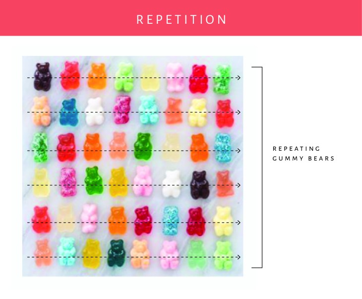
By taking the gummy bears and repeating the design on a loose grid, they are conveying a message. “We are fun”. The random colors help this design feel less stuffy vs the option of having the same color of gummy repeated throughout the design. I love the simple background- a marble slab. This helps convey a feeling that these are high end and made in a kitchen. The colors and feel match the other posts in their feed.


315Wk5Asset 11@4x-100

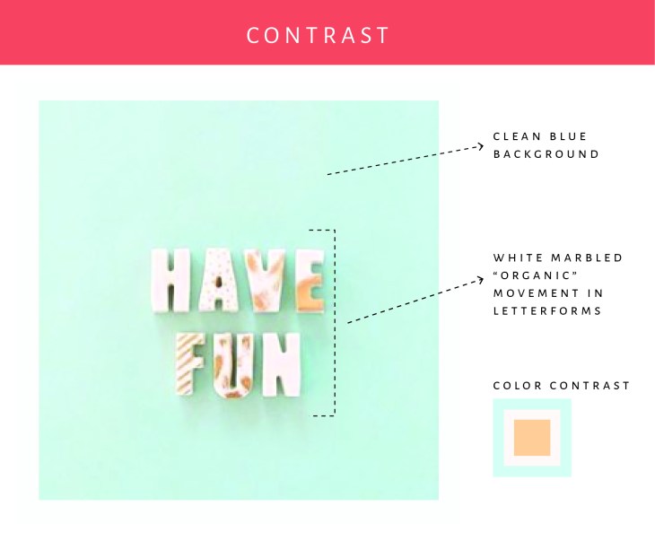
In this example I am focusing on the contrast. The blue background contrasts nicely with the letterforms that are done in a marbled cream. The colors are great together, and the addition of the subtle shadowing helps the letters stand out on the page.


315Wk5Asset 9@4x-100

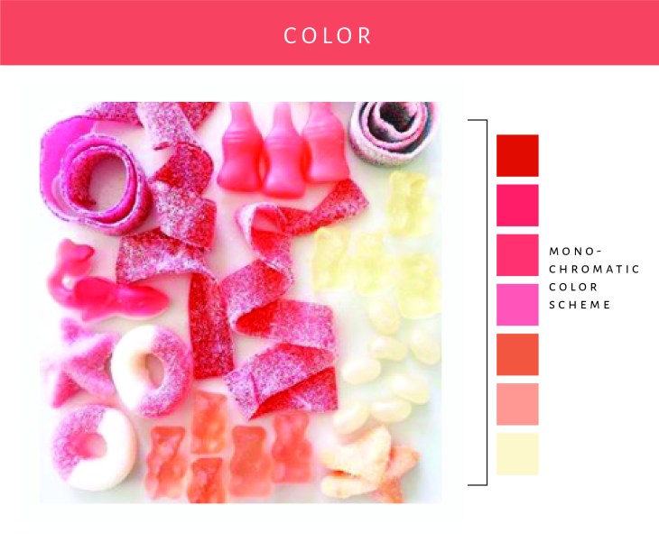
The colors in this image are so fun. They have combined different candies and sort of done an ombre effect. The organic placement and styling of the candies help convey a sort of playfulness to the design. This goes right along with the look and feel that one would expect when looking at Lolli and Pops social media channels.


315Wk5Asset 10@4x-100

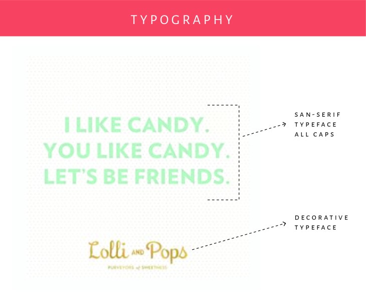
There were not a lot of typography examples on Lolli and Pop’s feed, but I did find this one. I love how they have used a simple san-serif typeface for the main wording that contrasts nicely with the typeface used in their logo. The colors are excellent too. I just love looking through their Instagram feed!

As you can see Lolli and Pop has done a really good job at establishing their look and feel on Instagram and their other social media channels. The designs are always colorful and clean feeling- they use a lot of white space. (Instagram’s setup really lends to this style.) I feel happy when I look at their feed and inspired by their designs.

Reverse Engineer a Social Media Post

For this assignment I would like to focus on the post: “Real Life Story Update 2018 Edition” from the blog, Vintage Revivals. (https://vintagerevivals.com/real-life-story-update-2018-edition/)

  1. What is the main purpose of the post?  This post shares a part of Mandi’s personal journey. The main purpose of the post is to share her experience so she can connect with her audience and be genuine and relatable.
  2. Who is the audience?  The audience for this post is readers of her blog, Vintage Revivals.
  3. How does the post connect with the audience?  Mandi does a good job of connecting with her audience in this post because she is authentic and genuine. She is sharing a very personal experience and allows her readers to capture a glimpse of what was going on during this time of her life. People that read this post can’t help but feel like they understand a little bit more about her as a person.
  4. What value does the post provide to their audience?  This post makes the reader feel like they know the blogger, Mandi. They are able to make a deeper connection with her by understanding her better. They feel more connected to the blogger and to her content. This post may also explain to some why the content may have been suffering- leading people to maybe give her another chance.
  5. How does the post’s design connect and communicate with the audience?  The aesthetics of Mandi’s blog are very clean and organized. Her use of white as the background color makes the blog easy to read and ensures that whatever colors she uses in her content works well with the overall design. She has also taken the time to structure her content into digestible paragraphs.
  6. What metrics will be used to determine if the post is successful?  This post’s success is determined by the amount of traffic generated to the site. Shares and comments on this post will also be used to gauge the effectiveness.


Personal Manifesto

When I was in elementary school my mom used to bring the old magazines from her dentist office home with her. I would spend hours cutting out beautiful images of colors, people, and typography- anything that spoke to me. I created a literal swipe file before I even realized what that was. I am obsessed with design. I love art and creating beautiful things. I love DIY projects and working with my husband on creative endeavors. I love product packaging and beautiful illustrations and color schemes.

inspirationboard2

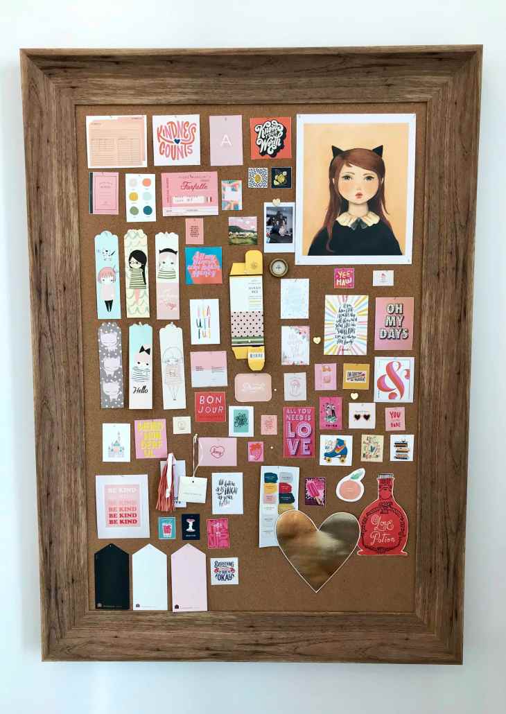
(This is a pic of my inspiration board as it currently looks- it is constantly changing!)

I dream of learning how to draw better, to illustrate on a computer- to take those images and use them to make people smile. I dream about creating beautiful designs and sharing the joy they bring with others. I dream of letting children and adults know that they are amazing, and a loving Heavenly Father created them for a purpose. I dream of helping my children and others find the things that they are passionate about.

With this blog I hope to share content that I find inspiring. I want to share things that I find interesting, or beautiful- things that can help me improve on my God-given talents and hopefully help someone else find their hidden talents and motivators. I want this blog to be a big swipe file for people looking to learn about what makes designs work, about learning new skills, or just sharing things that are beautiful or hilarious to inspire creativity. We will all learn together. I am excited to share content about the things that I am passionate about. This blog will be the main platform for sharing content, but I also plan on sharing on Instagram and or Pinterest.

L’Eggo my Social Campaign Analysis

When season one of Stranger Things dropped Eggo, owned by Kellogg, noticed that social media was buzzing with Eggo and Stranger Things mentions. The Eggo team and brand agency binge watched the series and were hooked. They were eager to share their love of Eleven and Stranger Things with other fans.

Here are some creative ways the marketing team promoted Eggo on social media-

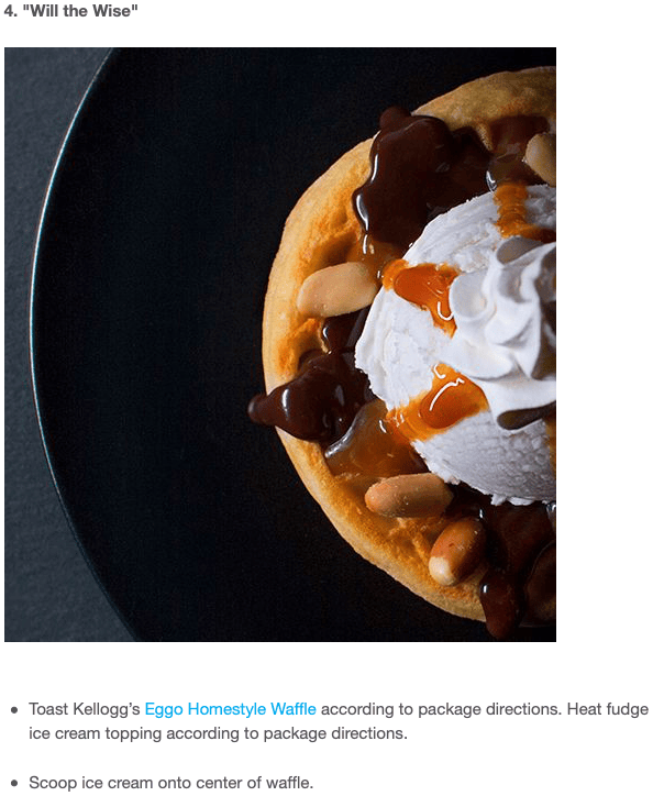
The marketing team came up with recipes for Eggo waffles that correlated with each episode in the season- here is one example:

eggo recipe

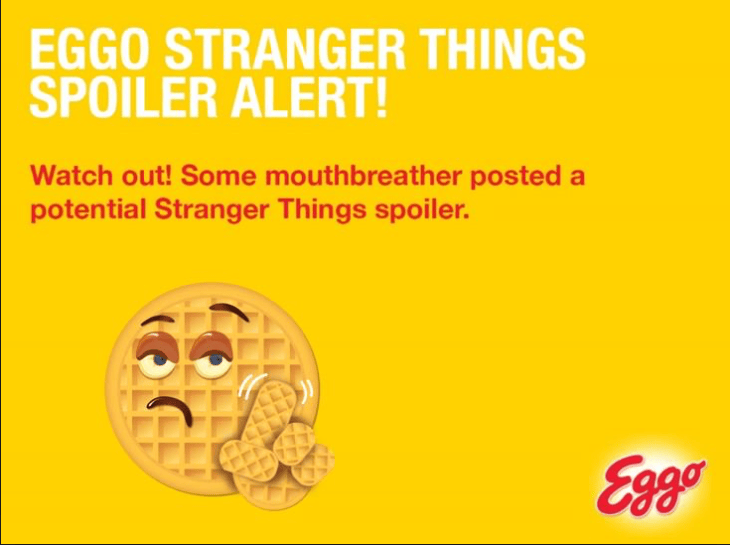
The team also created an extension for Google Chrome called “L’Eggo My Spoilers” which blocked spoilers related to Stranger Things so the superfan user could enjoy the series at their own pace- free of spoilers.

eggo spoiler

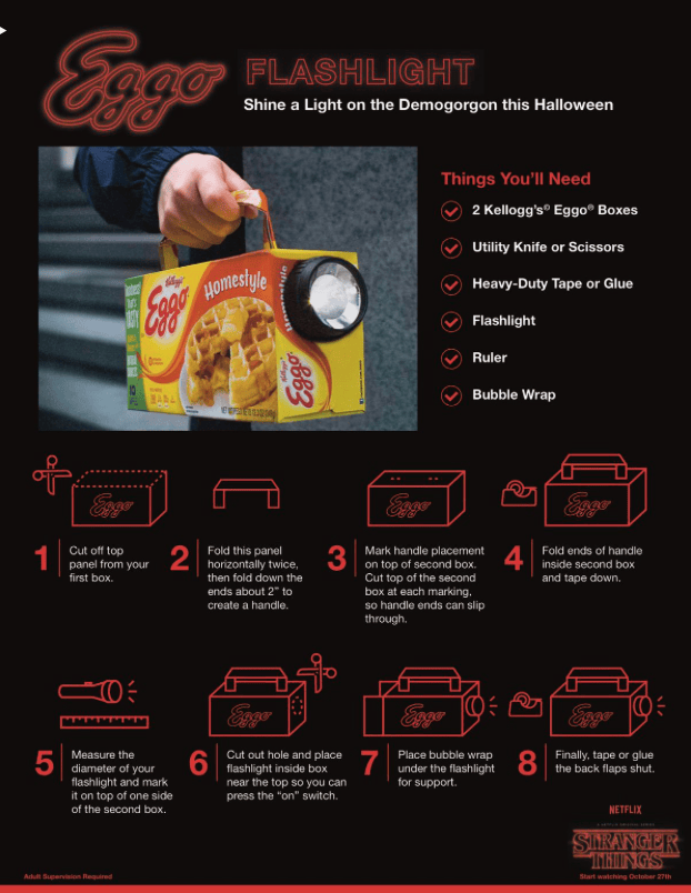
Anticipating the popularity of Eleven’s character as a Halloween costume, the team designed a DIY projects. This DIY Eggo flashlight is a fantastic and practical addition to any fan dressed as Eleven.

eggo diy

This social media campaign was a huge success for Eggo and for the Netflix series, Stranger Things. On Twitter alone, Eggo was mentioned 41,200 times in October of 2017. Due to this success on Twitter, Eggo earned approximately $201,801 in earned media value.

By joining the fans of Stranger Things, Eggo was able to connect with their audience and become relevant with a younger generation. Eggo has done a great job of inserting themself into a pop culture phenomenon and capitalizing on it. Their fun and creative marketing strategies are exciting and promote the show as much as they do the product. This approach makes it feel like fun and fandom- not advertising. The principles in play here are Value, Zeitgeist, and the Story Principle.

Value- The user gets free stuff they are interested in by viewing the content.

Zeitgeist- Stranger Things is a pop culture phenomenon. Eggo capitalized on it.

Story Principle- The Eggos tell the story of Eleven. The viewers are engaged in her story and interested in expanding it in their own way.

This was an awesome social media campaign. So fun and relevant- it makes Eggo seem that way too.