REP Sponsered Promotion Post

REPAsset 7.jpg

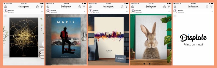
This sponsored post from Displate popped up on my Instagram today. The content scrolled fairly quickly through some samples of their work. By using this format, it caught my eye because it was moving, and made me want to watch since the images were kind of interesting. On the last page, the company’s name and “prints on metal” showed up. This was a great tactic since now I knew kind of what I was looking at. Here are some more details that helped this sponsored post catch my eye…
REPAsset 10.jpg


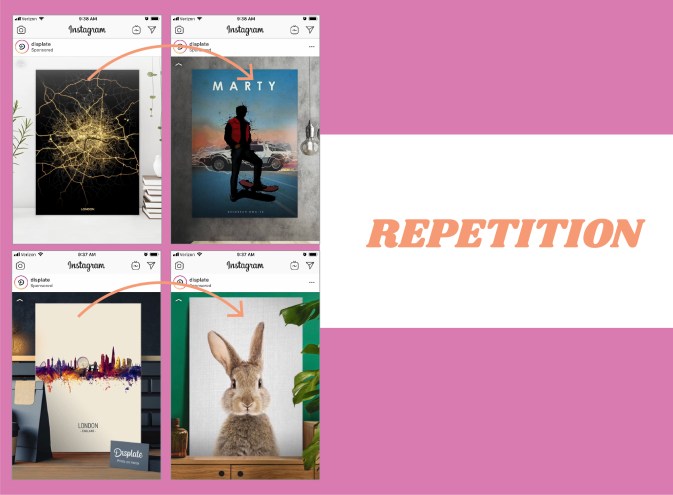
By using the same kind of spacing and alignment on each image being showcased, the scrolling ad took the guesswork out of where I should be looking. Each image popped up in the same spot so that the quick scroll wasn’t too jarring since my eyes could stay focused on the same part of the screen. The repetition of the design was vital to this ad and its quick scrolling images.
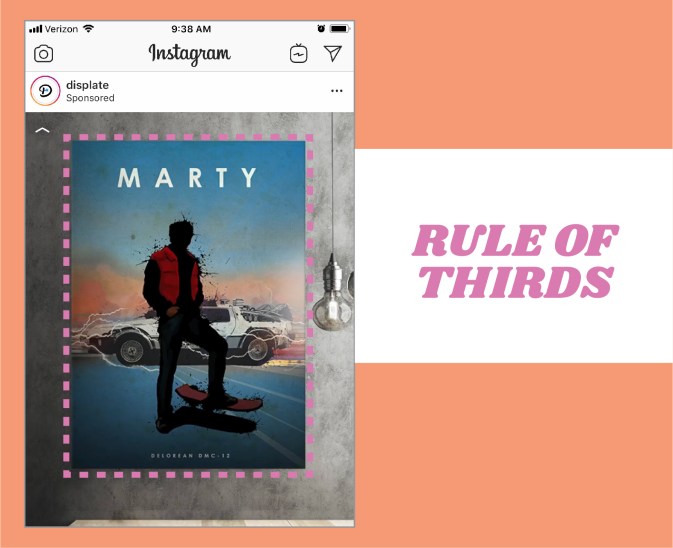
REPAsset 5

In this example, you can clearly see that the poster image is taking up the majority of the space. The rule of thirds is being applied here since 2/3 of the design is the main image. This makes the image the prominent item in the design, and therefore what your eye really focuses on. This is a good tactic for a company that is selling the item pictured.
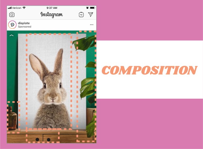
REPAsset 6

This image is my favorite from the series. The entire composition of the image is really great. The bunny image is directly centered, but the piece doesn’t feel static, because the dresser that it is sitting on is not centered. The leaves on the right and the bottle on the left help the image feel balanced. Another great aspect of this image is the use of color. The green wall contrasts fantastically with the white of the bunny print and the warm wood tones of the dresser.
 

REP- Native Video

REP1Asset 1@4x-100.jpg

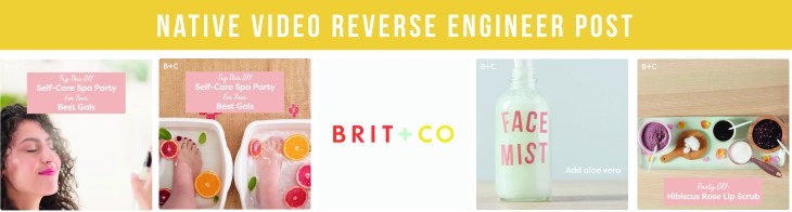
This native video caught my eye due to the beautiful colors, and clean design. I am a sucker for a great color scheme and pulled shots from this native video to create some new color palettes. I love how this video is edited. There are fun animations, a catchy tune, and clean designs and typography. I believe the audience for Brit & Co is women, so they are definitely speaking to their audience with a feminine color scheme and a video about a spa day. Here are some breakdowns of why this video works-

REP2Asset 2@4x-100.jpg

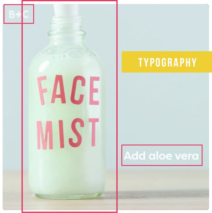
The typography in this video is very subtle and understated. The typefaces are san-serif and give the video a modern, clean feel. By using this typeface throughout the video the design feels seamless. The text is also very easy to read, which is good when someone is watching to see how to do something. I think the subtle branding in the top left corner is awesome. You don’t notice it so much when you are watching the video, so it is not distracting, but the company’s brand is visible on each frame.

REP3Asset 3@4x-100.jpg

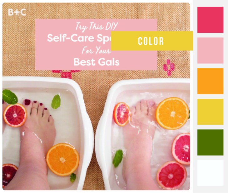
The colors in this video really work. They are bright and springy- which was really appealing to me on this dreary day in March. The colors also feel young and vibrant, which definitely resonates with Brit & Co’s user base. The use of white in the frames help the colors pop. The organicness of the sliced fruit and its beautiful color really tie into what the video is about. The use of color throughout this video is probably one of it’s strongest elements.

REP4Asset 4@4x-100.jpg

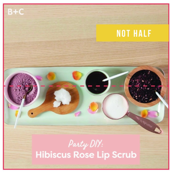
Another principle the artists implemented into this video is the principle of not half or asymmetry. There are a lot of shots in that fit that description. Everything is kind of just slightly off-center. I think by using this principle, the overall feeling is more artistic and also has a feeling of movement- even if the background is still.

I loved dissecting this awesome native video from Brit & Co. Their clever use of color, asymmetry, and typography make this video an inspiration piece for future work.