Reverse Engineer Post- News Feed

BlogPostPicAsset 1@4x-100.jpg

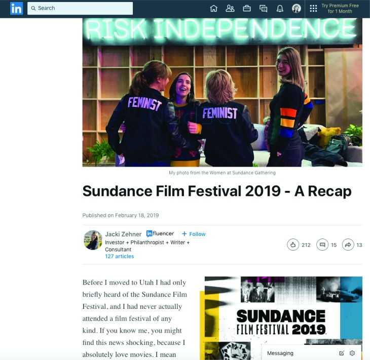
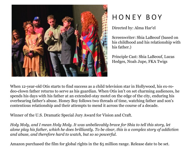
This week, as I was scrolling through LinkedIn I clicked on a link to a news story about the Sundance Film Festival. I live in Utah, but have never been to the festival, so this seemed like an interesting article to read. I loved reading about the movies that the reviewer wrote about. There is so much creativity in these films! The post, itself, was well written, but wasn’t really super interesting to look at. Still, I was able to find that they did follow some design principles in the structure.

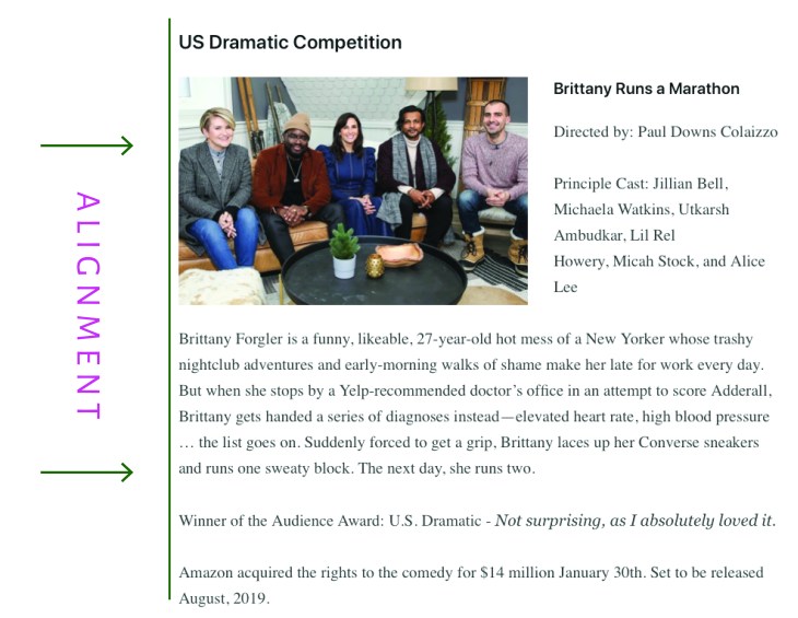
First, alignment.

BlogPostPicAsset 2@4x-100.jpg

The alignment in this news feed is good because it is predictable and easy to read. The content is always aligned on the left with a rag on the right- which is how we are used to reading in the English language. Nothing super exciting, but consistent, and easy to read.


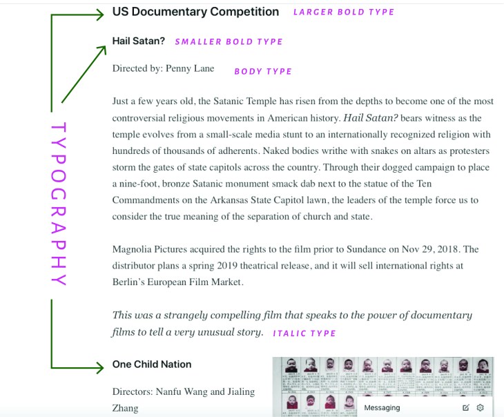
Second, typography.

BlogPostPicAsset 3@4x-100.jpg

The typography on this news feed design is pretty subtle, but it works. The titles to the film category are the largest and boldest, the names of the films are bold, but not as large as the category, the body type is regular, and the author’s thoughts on the film are always italicized. This makes it easy to pick out the information you would like to read without having to read the entire article.


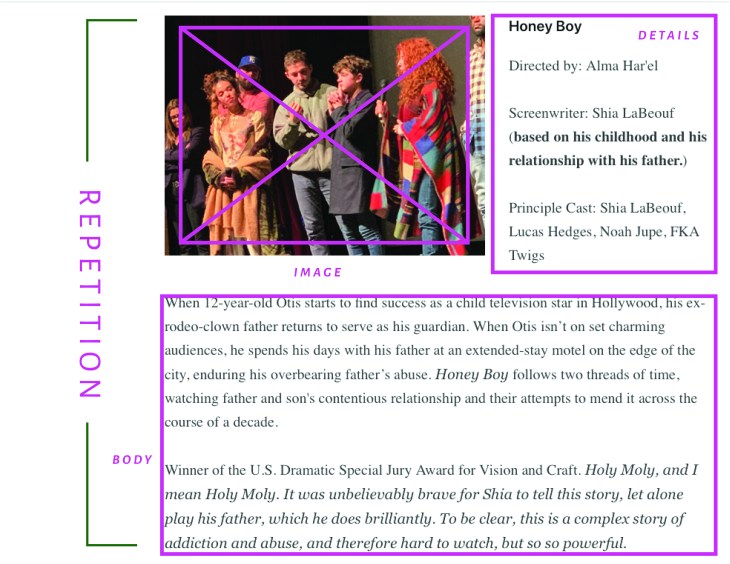
Third, repetition.

BlogPostPicAsset 4@4x-100.jpg

This news feed is consistent in its styling. The setup is always the same with an image sharing rows with the film’s title and actor details, followed by a chunk of body text. There is some variation between the image being on the left and then sometimes on the right, but the overall design is just repeated for each film mentioned.


An easy change.

BlogPostPicAsset 5@4x-100.jpg

In my opinion, this news feed design could have been improved by simply giving more hierarchy to some of the typographical elements. On this mockup I have kept the same basic structure, but have given the film title more emphasis with the use of a contrasting font- highlighted with wide letter tracking and all caps.  I think this super simple change helps the design a lot, because it makes the information more readable.

Brand Identity

IPPIE PLAN

OBJECTIVES:

The message of this brand is happiness conveyed through bubble gum. The feelings of youth and pluck will be conveyed through bright colors and fun images. The target audience is mainly women between the ages of 18 and 50.  After viewing the messages of this brand the viewer should be lighter and happier than they were before. The goal is that they put a smile on their face and confront their day with hope and optimism. A secondary goal is that they look for the fun in everyday experiences, and learn not to take themselves too seriously.  I hope that by viewing the vibrant images on these channels the user will be able to instantly smile, and then recollect the colors, feelings, and messages throughout their days and weeks.

SEASCAPE PRINCPLES:

The “value principle” will come into play in these social media channels. The hope is that the user will gain joy from simply viewing the content. They don’t need to buy anything, although it may make them crave gum, they simply get to look at the post and feel something. The return on the viewing investment time will be more than worth it if these channels can deliver great content that is beautiful to look at.  The “Zeitgeist principle” will also come into play on these channels. There is so much negativity and heaviness in what we consume online and in our lives, that people are looking for an escape. This brand hopes to be that escape for people. “Taking action” for this social media brand will be viewing the content and coming back again to view more posts. When branding this channel we will strive to avoid these taboos- posting mediocre photos, going too “off brand”, not responding to comments,  omitting captions, and being inconsistent.  The messages presented will also always try to convey fun and happiness, no other political or personal agenda.

STRATEGY

To connect with our audience this brand will consistently post content, make sure the content is relative to the brand and reply to comments.

The channels I have chosen to use for this branding project are Instagram and Pinterest. Both platforms get results from good images, so the images created for this brand have to be cohesive with the brand objective and be eye-catching. They have similar taboos in that you shouldn’t follow or repin content that is not cohesive with your brand. They also require consistent engagement and comment interaction where appropriate. For both platforms the most important piece of content is the image. If the image falls flat, nobody is going to engage with your brand- the images are king on these platforms. Also important are hashtags, and captions. The captions and descriptions for the images must be relevant and reflect the goal of happiness within the brand.

CONTENT NEEDED

Image: In both PInterest and Instagram, the images are the key. The feeds are visually oriented, so the image has got to be eye-catching.  In Pinterest the recommended size for pins that generate interaction  is 735 px x 1102 px. The long images command more viewing real estate and are a great way to get your image seen. On Instagram the design should be done in 1080 px by 1080 px. (But upload the image at 2048 by 2048)

Caption/Description

In Pinterest, write descriptions that are thoughtful and that your user can understand. Use keywords, but don’t stuff them in if they don’t add value to your description. Also, the use of “salesy” text is discouraged.  The content for Instagram is similar.

Keywords/Hashtags

In Pinterest, you can optimize your pins for searchability by adding keywords. Relevant hashtags can also help your content be found by Pinterest users. Like Pinterest, Instagram allows you to implement hashtags that can be used to help viewers find your content. Care must be taken in choosing these hashtags, and be sure to make sure not to use any banned hashtags.


SCHEDULE
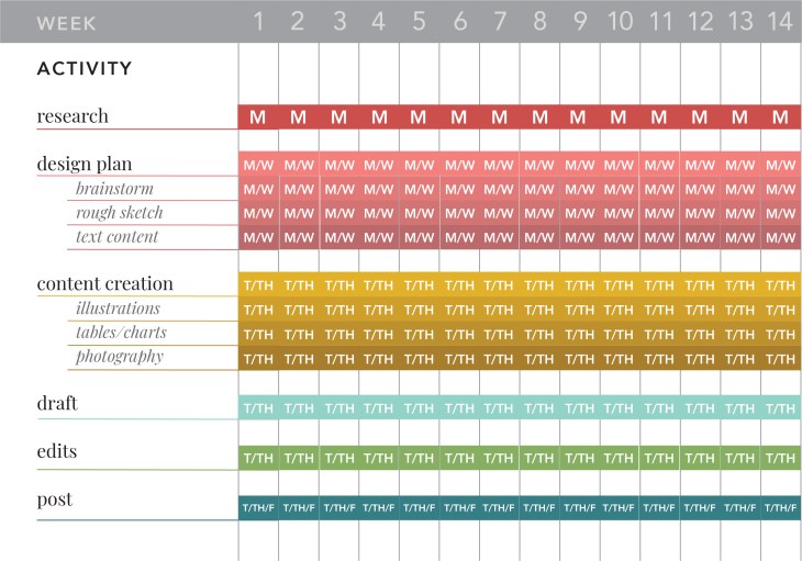
GanntChartWK5Asset 2@4x-100


DEFINE SUCCESS

The metrics that will best help me determine the success of my social media sites will be the number of visitors to my channels, and the number of repeat visitors and or followers.


VOICE STATEMENT

The “I Heart Gum” brand should feel fun. It should convey feelings of nostalgia and childhood. Although the subject matter could be considered juvenile, the design will be sophisticated with pluck! The feed will be full of fun colors and playful designs that should evoke a smile or a feeling of inspiration. The messages are always light and playful, never divisive or confrontational.

LOGO SKETCHES
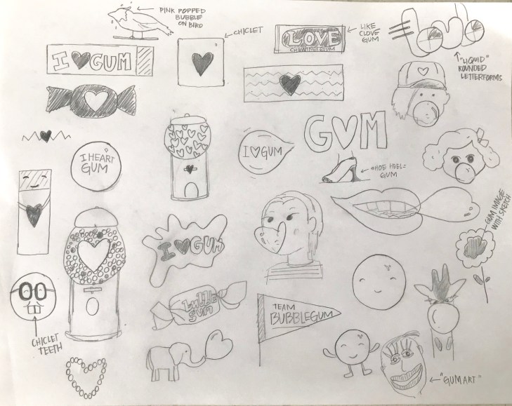
Comm315BrandLogoSketchesWK5.jpg

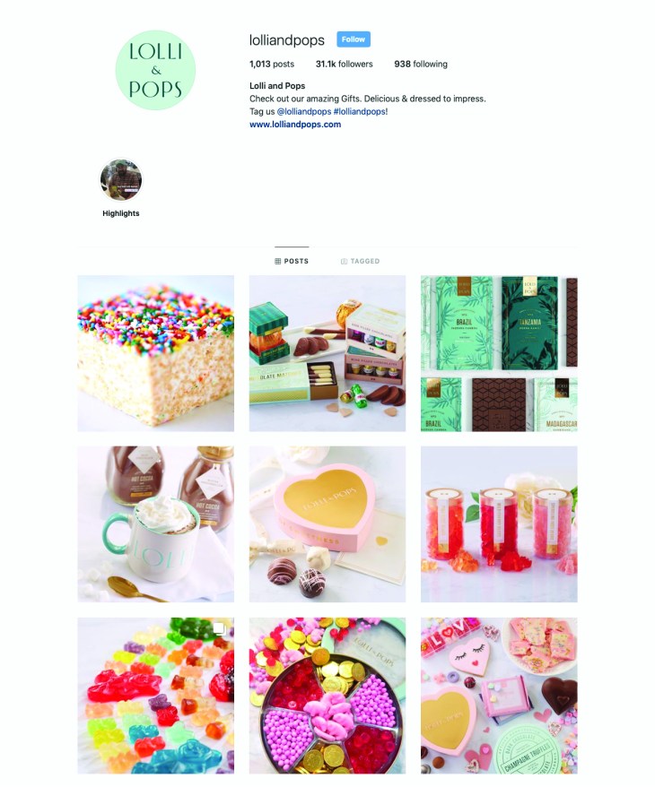
Lolli and Pops- Reverse Engineer Post


315Wk5Asset 4@4x-100

You guys! Don’t you just love the look and feel of this social media campaign!? Lolli and Pops is a candy company that promotes smiles and sweets. They use beautiful colors and packaging to sell their yummy confections. The audience for Lolli and Pops social media channels are adults that love sweets. I would imagine the purveyors of their sites love good design and are willing to pay for beautiful packaging. Lolli and Pop is embracing the “seascape” in a lot of ways. One thing that stands out to me is their focus on color and lightness- this conveys happiness. Zeitgeist is the principle that best fits this. At this time in history, with so much negativity, I think a lot of people crave something that is just fun and simple. Lolli and Pops promotes this principle through sugar and great design! Another principle they are applying is perception. This company is known for its beautiful packaging and yummy sweets. They keep that consistent in their social media images. They also know that the people that are viewing their content are concerned by how they are presented as well. When you buy someone a beautifully packaged treat from Lolli and Pop you are conveying a message to the receiver- you know good design and you want to share that- along with some sugar, with the recipient.

In this post I am using examples from Lolli and Pops Instagram feed, but they use the same principles in their other social media platforms.


315Wk5Asset 7@4x-100

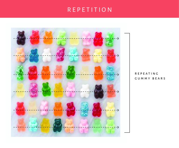
By taking the gummy bears and repeating the design on a loose grid, they are conveying a message. “We are fun”. The random colors help this design feel less stuffy vs the option of having the same color of gummy repeated throughout the design. I love the simple background- a marble slab. This helps convey a feeling that these are high end and made in a kitchen. The colors and feel match the other posts in their feed.


315Wk5Asset 11@4x-100

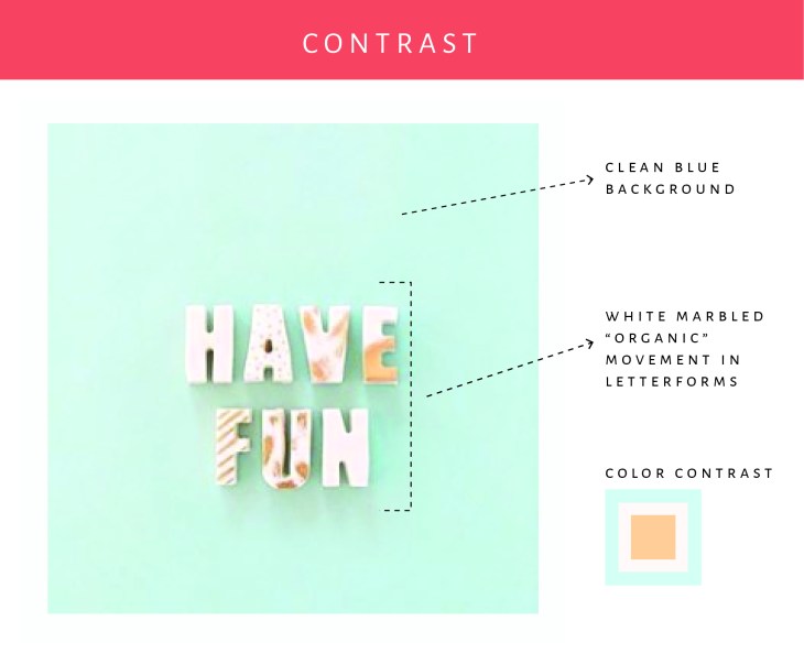
In this example I am focusing on the contrast. The blue background contrasts nicely with the letterforms that are done in a marbled cream. The colors are great together, and the addition of the subtle shadowing helps the letters stand out on the page.


315Wk5Asset 9@4x-100

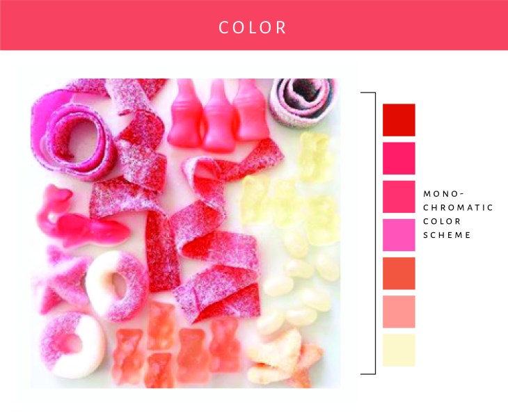
The colors in this image are so fun. They have combined different candies and sort of done an ombre effect. The organic placement and styling of the candies help convey a sort of playfulness to the design. This goes right along with the look and feel that one would expect when looking at Lolli and Pops social media channels.


315Wk5Asset 10@4x-100

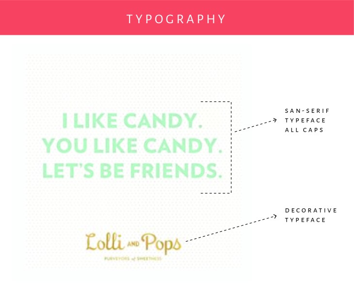
There were not a lot of typography examples on Lolli and Pop’s feed, but I did find this one. I love how they have used a simple san-serif typeface for the main wording that contrasts nicely with the typeface used in their logo. The colors are excellent too. I just love looking through their Instagram feed!

As you can see Lolli and Pop has done a really good job at establishing their look and feel on Instagram and their other social media channels. The designs are always colorful and clean feeling- they use a lot of white space. (Instagram’s setup really lends to this style.) I feel happy when I look at their feed and inspired by their designs.