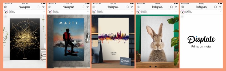
This sponsored post from Displate popped up on my Instagram today. The content scrolled fairly quickly through some samples of their work. By using this format, it caught my eye because it was moving, and made me want to watch since the images were kind of interesting. On the last page, the company’s name and “prints on metal” showed up. This was a great tactic since now I knew kind of what I was looking at. Here are some more details that helped this sponsored post catch my eye…
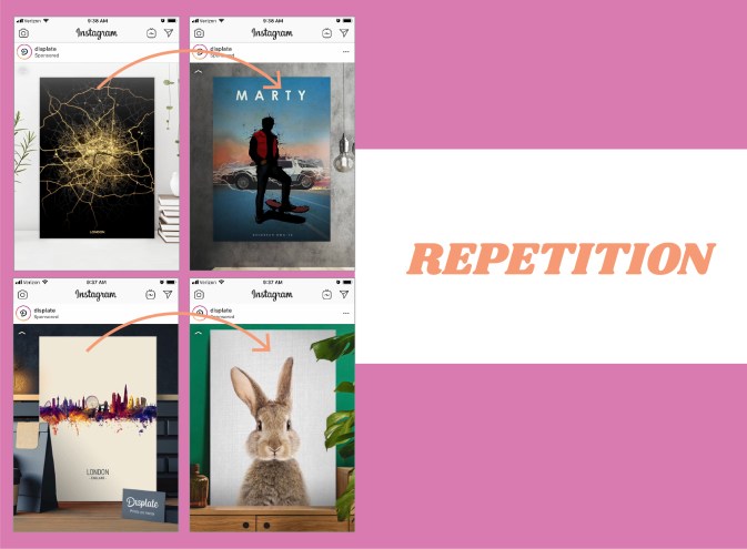
By using the same kind of spacing and alignment on each image being showcased, the scrolling ad took the guesswork out of where I should be looking. Each image popped up in the same spot so that the quick scroll wasn’t too jarring since my eyes could stay focused on the same part of the screen. The repetition of the design was vital to this ad and its quick scrolling images.
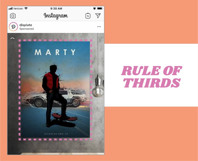
In this example, you can clearly see that the poster image is taking up the majority of the space. The rule of thirds is being applied here since 2/3 of the design is the main image. This makes the image the prominent item in the design, and therefore what your eye really focuses on. This is a good tactic for a company that is selling the item pictured.
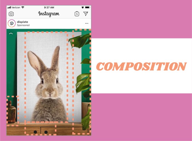
This image is my favorite from the series. The entire composition of the image is really great. The bunny image is directly centered, but the piece doesn’t feel static, because the dresser that it is sitting on is not centered. The leaves on the right and the bottle on the left help the image feel balanced. Another great aspect of this image is the use of color. The green wall contrasts fantastically with the white of the bunny print and the warm wood tones of the dresser.

