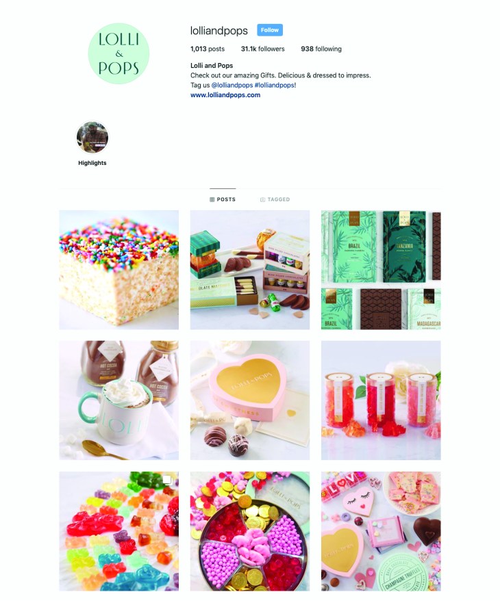
You guys! Don’t you just love the look and feel of this social media campaign!? Lolli and Pops is a candy company that promotes smiles and sweets. They use beautiful colors and packaging to sell their yummy confections. The audience for Lolli and Pops social media channels are adults that love sweets. I would imagine the purveyors of their sites love good design and are willing to pay for beautiful packaging. Lolli and Pop is embracing the “seascape” in a lot of ways. One thing that stands out to me is their focus on color and lightness- this conveys happiness. Zeitgeist is the principle that best fits this. At this time in history, with so much negativity, I think a lot of people crave something that is just fun and simple. Lolli and Pops promotes this principle through sugar and great design! Another principle they are applying is perception. This company is known for its beautiful packaging and yummy sweets. They keep that consistent in their social media images. They also know that the people that are viewing their content are concerned by how they are presented as well. When you buy someone a beautifully packaged treat from Lolli and Pop you are conveying a message to the receiver- you know good design and you want to share that- along with some sugar, with the recipient.
In this post I am using examples from Lolli and Pops Instagram feed, but they use the same principles in their other social media platforms.
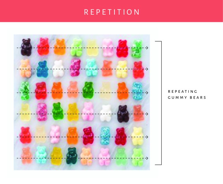
By taking the gummy bears and repeating the design on a loose grid, they are conveying a message. “We are fun”. The random colors help this design feel less stuffy vs the option of having the same color of gummy repeated throughout the design. I love the simple background- a marble slab. This helps convey a feeling that these are high end and made in a kitchen. The colors and feel match the other posts in their feed.
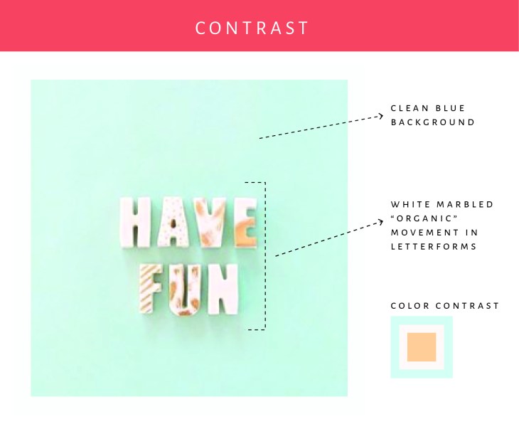
In this example I am focusing on the contrast. The blue background contrasts nicely with the letterforms that are done in a marbled cream. The colors are great together, and the addition of the subtle shadowing helps the letters stand out on the page.
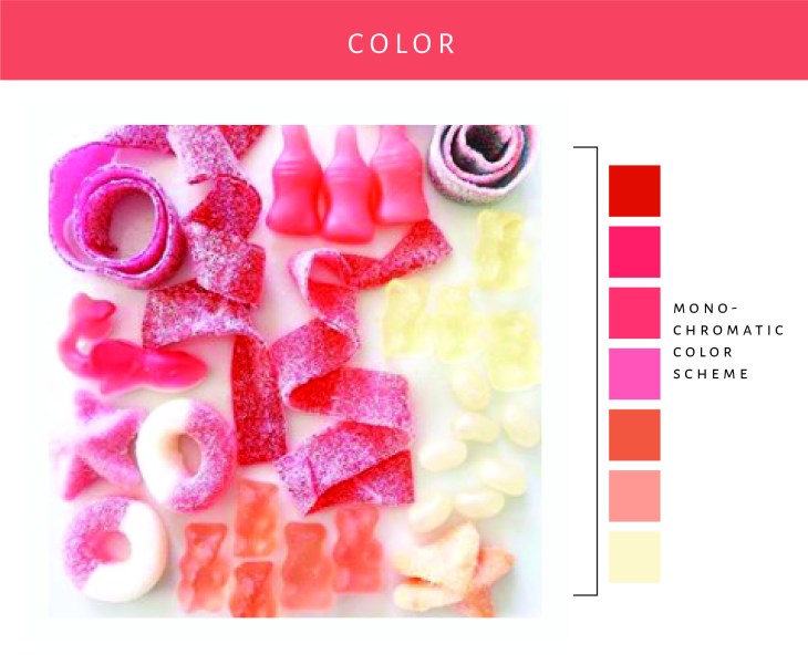
The colors in this image are so fun. They have combined different candies and sort of done an ombre effect. The organic placement and styling of the candies help convey a sort of playfulness to the design. This goes right along with the look and feel that one would expect when looking at Lolli and Pops social media channels.
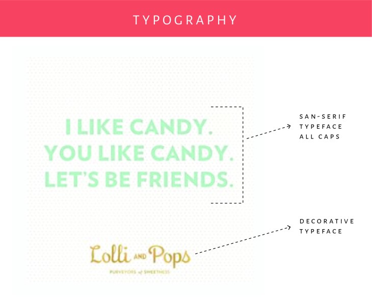
There were not a lot of typography examples on Lolli and Pop’s feed, but I did find this one. I love how they have used a simple san-serif typeface for the main wording that contrasts nicely with the typeface used in their logo. The colors are excellent too. I just love looking through their Instagram feed!
As you can see Lolli and Pop has done a really good job at establishing their look and feel on Instagram and their other social media channels. The designs are always colorful and clean feeling- they use a lot of white space. (Instagram’s setup really lends to this style.) I feel happy when I look at their feed and inspired by their designs.

